

VIA “huffingtonpost.com” by Joe Satran
Driving through the farmlands of Iowa looking for fresh food to eat is a lot like sailing through the ocean looking for fresh water to drink. In the ocean, you’re surrounded by water that you can’t drink; in Iowa, you’re surrounded by food you can’t eat. Even though Iowa generates the second-highest amount of revenue of any state off its crops — $17 billion in 2012 — the overwhelming majority of that comes from field corn, which is destined mostly for animal feed and ethanol, not dinner plates.
I came upon this startling fact while trying to answer a seemingly simple question: What crop generates the most money in each state? The Department of Agriculture’s National Agricultural Statistical Service produces reams of data on such matters, so I figured the question would be easy to answer. But it turned out to be trickier than I thought, because when I pulled the data, I realized that in most states, the biggest crop was one that was used mostly for animal feed. For well over half the states, field corn, soybeans or hay was the crop that generated the most cash in 2012, the latest year for which data are available. Though a small share of some of these crops does eventually get eaten by humans, in the form of things like soy lecithin and high-fructose corn syrup, most of it is fed to animals raised for meat or dairy.
To get more meaningful results, I decided to strip away those crops that are used largely for animal feed, and focus on crops that people actually eat. I plotted the results on a map, which revealed some surprising trends:
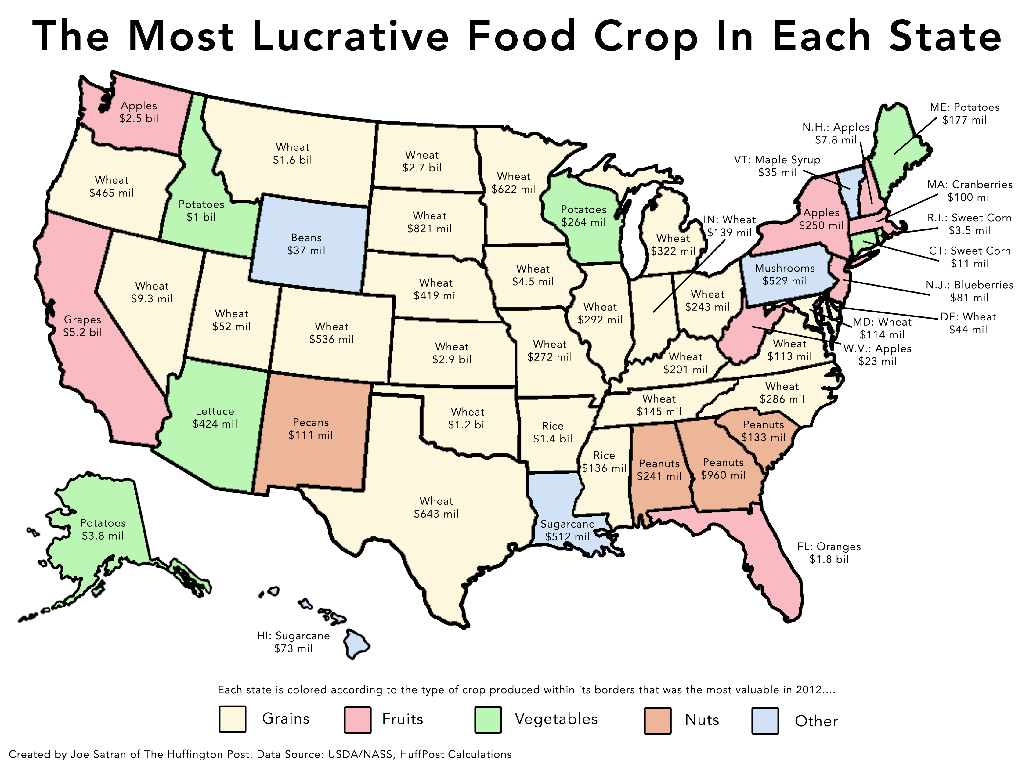
All that wheat! It seems nobody’s told heartland farmers about the gluten-free trend quite yet. The non-wheat states are even more interesting. Some are expected: oranges in Florida, potatoes in Idaho, apples in Washington. But what about the pecans of New Mexico, or the mushrooms of Pennsylvania? Or the fact that grapes — used mostly for wine — generate more than $5 billion a year in California?
I was also struck by what the map didn’t show: the power of the corn belt. When I excluded crops that are fed to animals, like corn, Iowa’s biggest crop generates a mere $4.5 million a year. This makes the state look like an agricultural weakling — which it totally isn’t.
So I did a little more analysis to find out the percentage of each state’s crop output, in terms of dollar value, that derives from the crops I had originally excluded: corn, soybeans, sorghum, barley and hay. I plotted these percentages onto a map as well. The result, if you squint, looks a little like an electoral map in a really terrible year for Democrats:
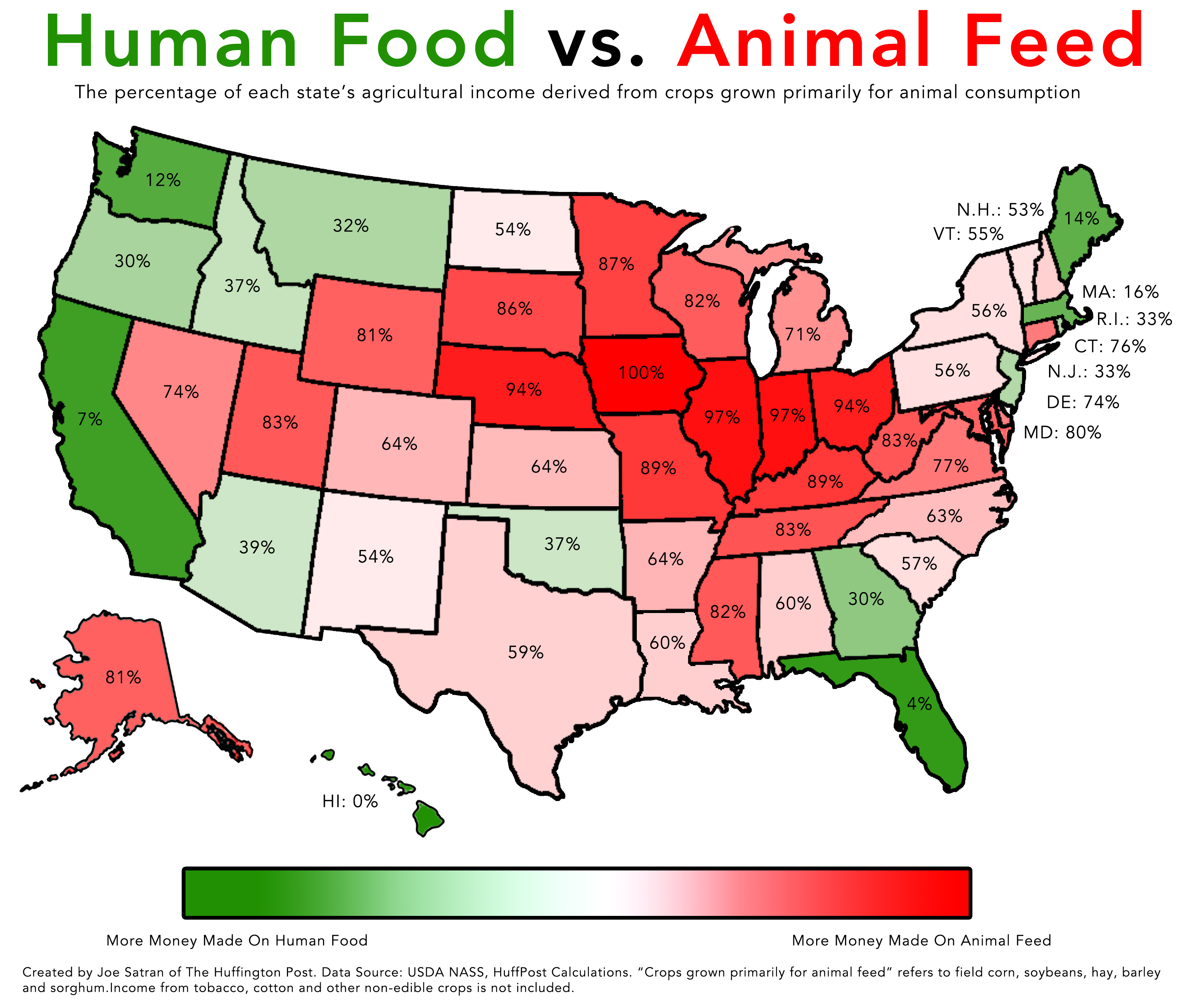
This second map shows that there are really two different Americas when it comes to agriculture: the heartland, where agriculture is focused on meat and dairy, and the coasts, where it’s focused on fruits and vegetables.